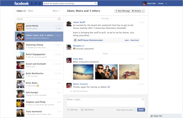
Facebook has today revamped the UI of Messages, introducing a two-pane view, something you generally see in desktop E-mail clients. The’ve also brought minor updates to the search feature in it.
One thing that’s evident is, Facebook wants more people to use Facebook Messages for E-mail, which was then rumored as ‘Gmail killer’. You can also see that they’re trying to isolate Messages from default Facebook layout (see the screenshot, there’s no sidebar on the left).
I don’t think this will in anyway help them in getting more users, honestly, I don’t know anyone who uses Facebook for E-mail. Heck, I’m not sure if Outlook can actually convince considerable number of Gmail users, even with a good product.
Regardless, the new UI looks good with the ability to add multiple photos.
On the other hand, they’ve made search a little better, as you can now search by sender’s name or keyword in conversation. For keyboard junkies, Facebook Messages will now support a full list of keyboard shortcuts – hit Alt (or Control if you’re on a Mac) + Q key combo to get access to the shortcuts.
Only if they had fixed those long persistent bugs, I’d use Messages more. The updates seem to be rolling out, I still don’t have access to it.

One Comment
how to set this facebook message style on my facebook id