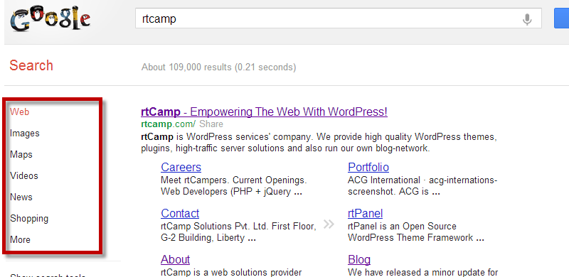
Google search options are very useful if you want to refine the search. Most people who use Google tend to ignore the various search options on the left-hand column.
This is how Google search results page looks at the moment.
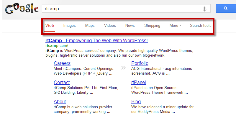
Today, I came across a new design by Google for its search results page. The options on the left hand column were neatly tucked away at the top, above the results.
This new change seems to mimic the way Google search results show up on mobile or tablet browsers.
I liked the new horizontal bar showing the search options, because it makes it easy to access. Usually in the long left-hand column format, the options show up one after another and that means users have to scroll up or down to get to navigate and choose different options.
This new design seems to be a lot more intuitive.
Have you seen your Google search queries showing up in such a design? Did you like the new horizontal search options design? Do drop in your comments.


You must be logged in to post a comment.