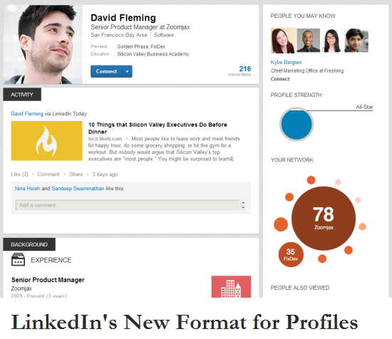
LinkedIn profiles pages are extremely simple and plain.This possible makes them boring when compared to profile pages of Facebook or Google+. But our LinkedIn profile does not need to be fancy with many photos and features as ultimately it serves as a online resume of sorts. Today, LinkedIn has started rolling out a newly designed profile layout.
The new profile is a lot more organized. It has more emphasis on current activities and updates of a user compared to just overall experience. Connections can also been seen as a mosaic of profile images which is very similar to Facebook.
It might have taken some inspiration from designs for profile pages from other popular social networks but thankfully LinkedIn is not trying to ape or clone them.
If you would like to activate the new profile layout for your account, then you can register your request at this link.
LinkedIn might also be introducing an option to allow other users to follow your profile without the need of your approval. This is similar to the Twitter model. Currently LinkedIn has already introduced this option on it’s own list of influential profiles.
What do your think about the new design of LinkedIn profile? Do drop in your views and opinions.
Link: LinkedIn Profile Sample

You must be logged in to post a comment.