While there are too many social networking/social media websites right now, Myspace doesn’t seem to care about this and plans for big changes including a relaunch.
Apparently, it must be years since you’ve logged into your Myspace account, but still there’s a chance you’ll like the new Myspace.

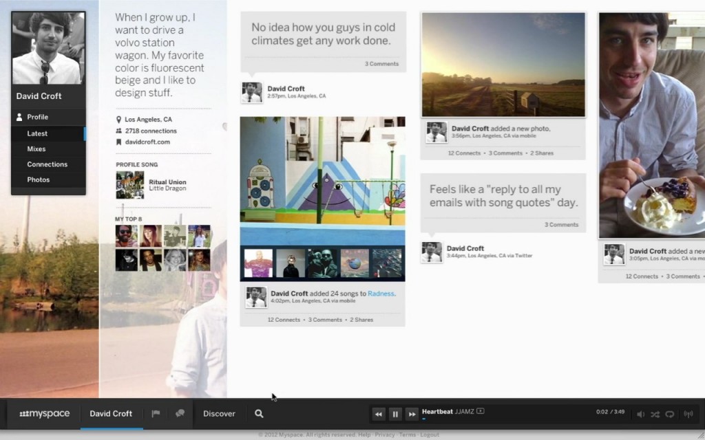
Unlike what you’d expect, the new Myspace is really neat in design – be it the typography or minimal style. Though, it looks more like designed for tablets, with vertical scrolling and large fonts.
They have also released a teaser, watch it.
There’s a navigation bar at the bottom, which Myspace calls as ‘deck’. This will have the music player allowing you to stream and share music. This is probably the only feature which can drive users to switch to the new Myspace, because Music is something Facebook didn’t put right.

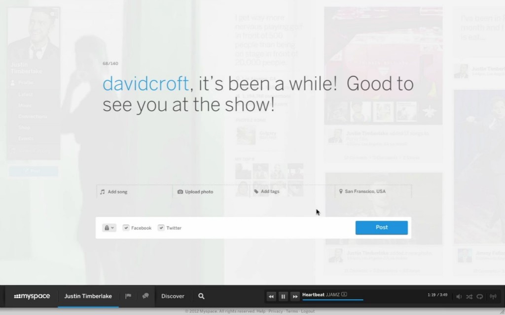
It also seems like you’ll be able to cross post to Facebook and Twitter, it’ll be interesting to see how Twitter’s new API restrictions can affect this. You also have the option to add a song, probably from Myspace’s music library.

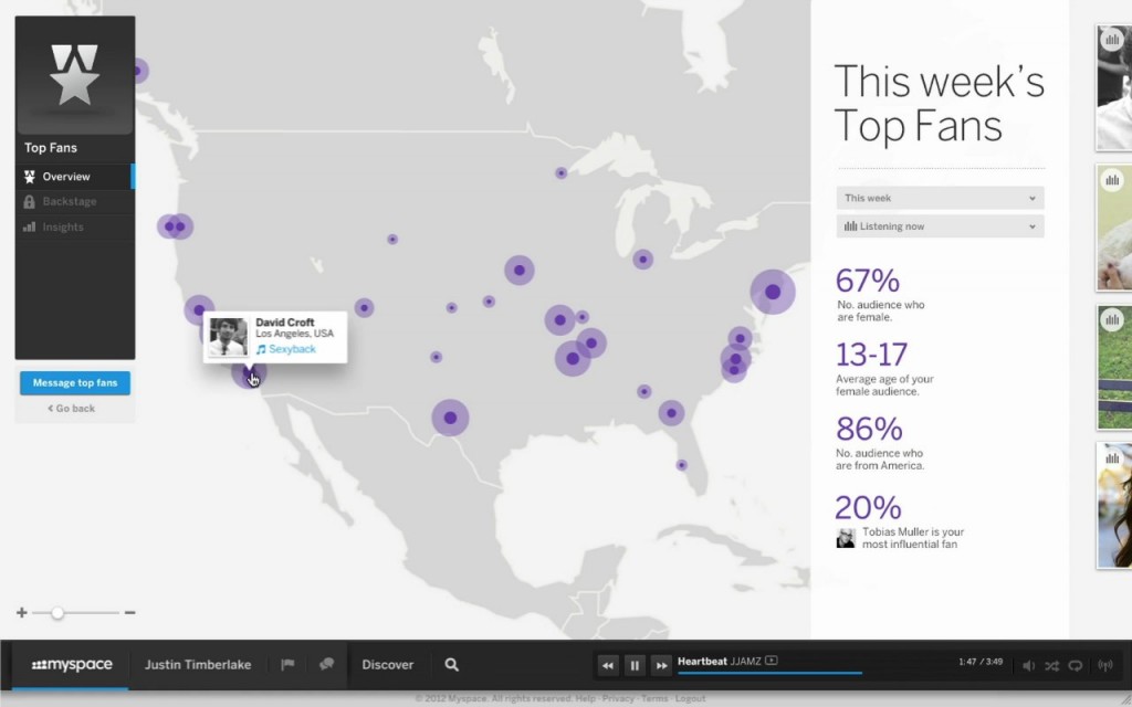
Business pages in new Myspace seem to be a lot fan focused, showcasing top fans of week.
Is this enough to drive users to make a switch?
The website is still not rolled out and one can’t make a firm comment on it. But most probably, this won’t make it. You see what happened to Google+, it’s not a fail, but not a big hit too. It’s like Bing of social networks i.e. few people do use it.
Features like music integration can bring the Myspace lovers back to their home, but except that I don’t think this will make big ripples.
You can sign up for an invite at the website. Do you have the patience for another social network? Do comment.
Link: Myspace
You must be logged in to post a comment.