If you are following Google for a year, you must be knowing Google changed its favicon sometime in June last year, and now, again Google has come up with a new good and sleek favicon.
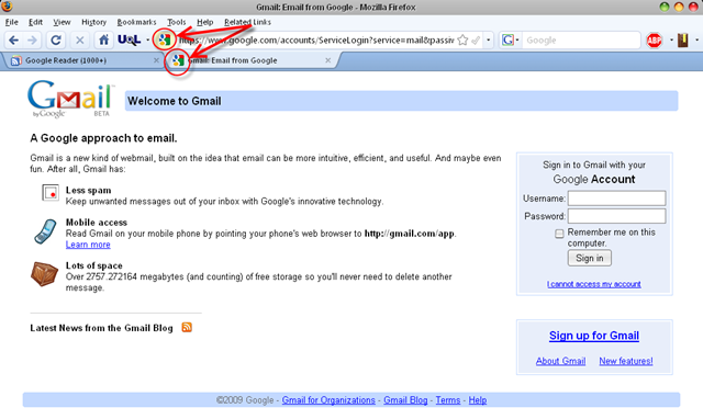
![]() This morning, when I opened Gmail homepage, I was surprised to see a colorful favicon instead and was wondering whether I was being redirected to some fake or phishing site. But even after refreshing and reopening, the page continued to show up the new favicon as you can see on the image. It was later, that I was confirmed about the change of logo when I read this official post. The blog says they considered changing favicon, because last time when the favicon was changed, many users complained that it was too “ugly”. In their words:
This morning, when I opened Gmail homepage, I was surprised to see a colorful favicon instead and was wondering whether I was being redirected to some fake or phishing site. But even after refreshing and reopening, the page continued to show up the new favicon as you can see on the image. It was later, that I was confirmed about the change of logo when I read this official post. The blog says they considered changing favicon, because last time when the favicon was changed, many users complained that it was too “ugly”. In their words:
Google changed its favicon last year and many people said that the new one was ugly. Probably this the reason why Google decided to use another favicon starting from today. The new favicon uses all the colors from Google’s logo, while keeping the same lowercase "g".
In this new favicon, all the colors present in Google’s logo are being used up and seems to be better than the previous one. Hope this move by Google be appreciated by all its lovers. 🙂
4 Comments
mmm… Yes, it is better than the previous one. But this time they are using too many colors 😛
I loved the oldest one which contained capital G 🙂
Totally unattractive. Google has no sense of design. You can also see that on their homepage. Their logo is pathetic.