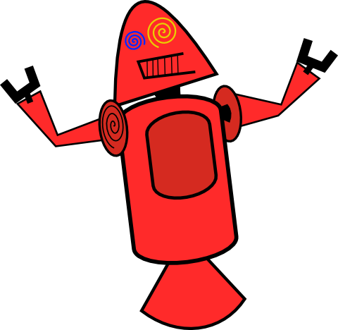
Android’s robotic logo is now famous. It looks friendly and cheerful, which although is a very difficult thing to do with a logo. That the current logo of Android could have been very different. Dan Morrill who works in Google’s Android Engineering team shared some of the early proposed logos for Android.
These proposed robotic logos nicknamed in Google as ‘Dandroids’ were shared by Dan Morrill on Google+.
One could hardly blame Dan Morrill for designing slightly scary looking robots as a logo as he is not a designer. He is an engineer and it is expected that his design ideas might at best be amateurish.
It would be one really hideous looking mascot if Google actually had not chosen a professional designer’s ideas which gave us the current mascot.
Thankfully better sense prevailed and Google has a much nicer, friendly looking Android logo 🙂 .
What are your views on these early proposed Android mascots? Do drop in your comments.


2 Comments
They look funny — glad that Google didn’t choose them.
they look funny 😀