If you’re a Chrome fan, like me, you must have installed any of the bleeding edge versions of Chrome, be it Chrome Dev, Canary or even Chromium. The Chrome team has worked on a new start page since a month and starting from Chrome Dev, all the upper channels can use that feature now.
What’s new in this start page?
Everything! Yes, they have changed everything. The new start page’s UI looks a lot like a tablet interface. Here are its features.
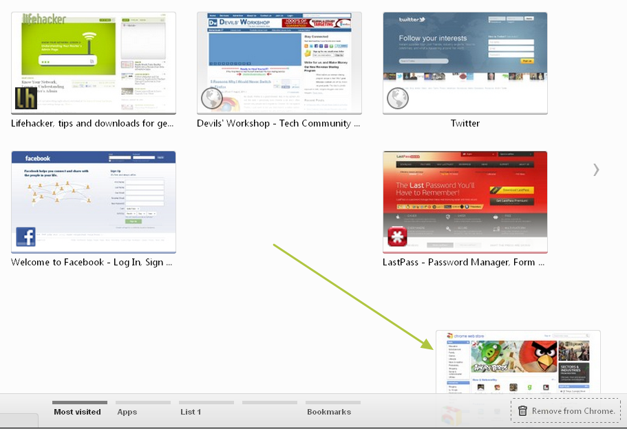
- The thumbnails of most visited sites are much bigger and cleaner now with respective favicons on them.
- Initially, the start page is divided into 3 sections – Most Visited, Apps and Bookmarks.
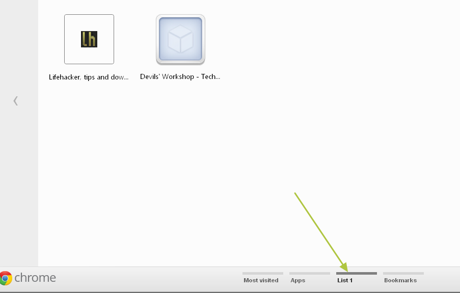
- However, you can make new sections by dragging the site from Most Visited section into a new section, you can rename it.
- You can rename the sections by double clicking the tab and changing it to whatever you want. Note that you can’t rename Most Visited and Bookmarks tab.
- You can remove a site from most visited by dragging into Remove From Chrome box.
- You can find the list of closed tabs from the Recently Closed menu on the extreme bottom-right.
- The Bookmarks tab showcases your bookmarks visually.
You can add some good effects to the new start page by enabling “New Apps Install Bubble” in about:flags
If you run any bleeding edge channels of Chrome, drop your opinions on this redesign.
Links: Chrome Dev | Chrome Canary


You must be logged in to post a comment.