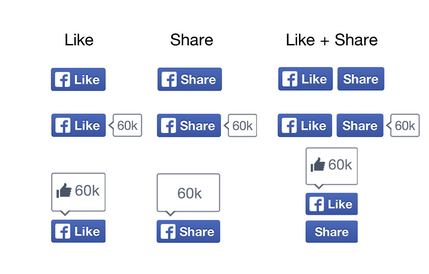
Facebook is pushing a new design to its iconic “Like” button. The “Like” button is now more or less a constant on just about any website, to get visitors sharing links on their own Facebook profiles.
Today, Facebook’s developer blog introduced a new way the “Like” button will show up. The new button has vectorised design. Facebook is also introducing the option of getting websites to use both the “Like” and “Share” button. The two buttons seem similar to people but they are actually very different. The “Share” button allows users to add a comment to the link they are sharing on their timeline. The “Like” button only shares the link on a users timeline.

How does one test the new “Like” button?
The Facebook “Like” and “Share” buttons are used by 7.5 million websites. But rolling out the new buttons to websites over time, Facebook is rolling the new button design to a percentage of users.
This is a bit strange as it might mean that a website owner might not see the newly designed button while visitors to the site might get to see the button. This could be problematic especially if the new design breaks or does not go well with the overall design of a website.
Are you seeing the new “Like” button and do you like it? 😉 Do drop in your comments.
Source: Facebook Developers Blog
4 Comments
Couldn’t they have just added a ‘dislike’ button to go next to the ‘like’ button?
I doubt FB would do that. It needs positive feedback only to get more signals on what you life. What you dislike is not really important to them as it cannot be highlighted.
Also dislike button would mean lower ranking to crap on the facebook which will stop many users from coming back.
till i have used many facebook like widget…..this one is awsome!!
But i badly need a dislike button more 😀