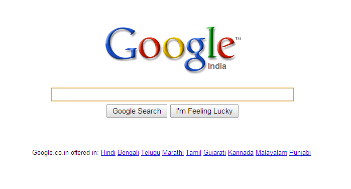
 After weeks of calibration and testing, Google has finally settled for the minimalist look on their homepage. What it does is, when you load the page you just see the Google logo, the search box, Google search and I’m Feeling Lucky button and the language options (if any). Now if you just move your mouse a little, BINGO, the usual google interface fades in.

Google Minimalist
From the official google blog:
For the vast majority of people who come to the Google homepage, they are coming in order to search, and this clean, minimalist approach gives them just what they are looking for first and foremost. For those users who are interested in using a different application like Gmail, Google Image Search or our advertising programs, the additional links on the homepage only reveal themselves when the user moves the mouse.
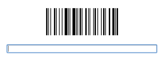
Over the testing period, the engineers tried over 10 variants of the minimalist-to-fade-in look, and finally settled for the one which majority of the users settled for. Among the variants, one output was like the one below (the time when the Google implemented the barcode doodle):

But why did they do it? Well its all about, ‘How simple can you get?’. Twitter, with only 140 characters, is the benchmark of simplicity. Now even with its real-time searches and Bing, well Google had to do something to up its ante!
One Comment
oooh . I thougt something wrong with my browser thats why its showing liks after few seconds…