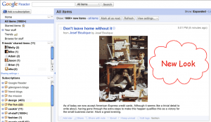
As expected, after making over Gmail with themes, Google has tried to revamp its feed reader as well. Unlike earlier, there’s more of white color instead of blue.
Well, I know you are desperate to know about the changes, I am coming to the point to discuss about the lift over made to Google reader’s look.
- As discussed, the new look contains more of White color. Just have a look on the images below, and you too can feel that.
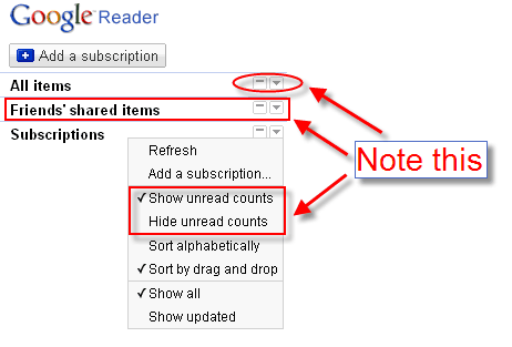
- Collapsible navigation. As shown in the image below, you can collapse or expand, all the side bar menus
- Hide unread counts – Using this option, you can hide the total unread items in your reader.
- Share options under individual section – If you are not in a practice of sharing items to friends regularly, this would be helpful for you as you can hide the complete item using the new ‘Collapse’ feature.
- More feed bundles – There are more sets of inbuilt feeds available for you to subscribe in the go.
Truly speaking, as of now, I felt Google reader is too complicated as such I stuck with ‘Feed Reader’, but I guess, this new look and feel of Google reader will surely attract me towards it. 🙂 By the way I am still wondering, are themes (as in Gmail) in the way to Google reader too? What do you think about it?
Links: Google Reader | Official news


One Comment
Google should give some different kind of buttons to webmasters for there website for Google Reader. They still have same old buttons.