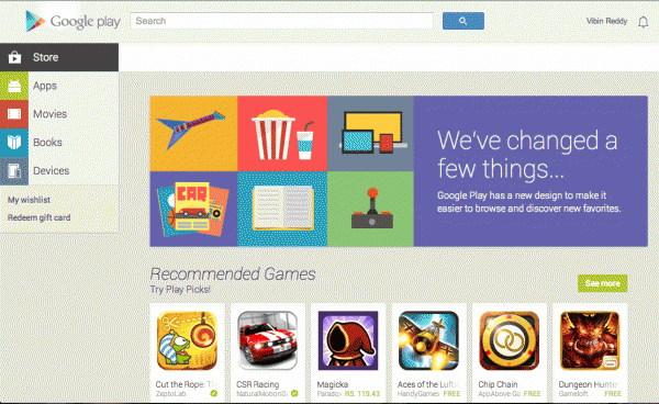
One of the announcements which didn’t get much attention at this year’s I/O, was about Play Store web getting redesigned. It’s kind of hilarious but Google took this much time to release the redesigned Play Store (almost two months). The Android Play Store app too got redesigned a month back.
To sum up the design of the new Play Store web in one sentence – it’s like Android, on the Web.
As you open the website, you’ll see a clean header image notifying you about the redesign. The icons have all the attention, in the new design. This is not expected, because generally app icons in Android are very inconsistent in size and never have a harmony between them.
The colors will look amazing. It’s the same ones you see on the Google’s new Android apps like Play Books, Movies and so on.
The app pages also look very good now. Screenshots will be viewed in full sizes and everything is nicely laid out. The Editor’s Choice page looks stunningly good because of the Roboto Slab. It’s the same typeface you see in Google Keep app and now it’s on Play Store web.
You can now also manage your Wishlist items right from the website. This functionality was so badly needed.
Play Store is of course not just about apps, so even the Movies, Books and Music sections look nice. There are a few inconsistencies like this which can be easily fixed.
I also see a “Redeem Gift card” option in the sidebar, after seeing which I got excited, but as it turns out, gift cards aren’t yet available in India.
If there’s one thing I miss in the new Play store, both the Web and Android versions, that’s the featured sections. Google has to bring that back.
Link: Play Store
Related: How To Return Android Apps After 15 Minutes Trial Window (it works just fine the new Play Store)

4 Comments
Looks pretty slick, definitely a big step up from what we have seen previously!
I have not visited the Playstore website for several months, I only use the one installed in my smartphone. The new design looks elegant
The website has gone way too slow, that circular arrow just keeps on rotating, while the entire webpage is disabled!!!
The new tiled interface of Google Play looks refreshing. It cuts out the clutter further and makes it easier to find what you want on it.
And as mentioned by you, the screenshots of the apps have better view now and makes possible to understand the functionality of the app even before downloading it.