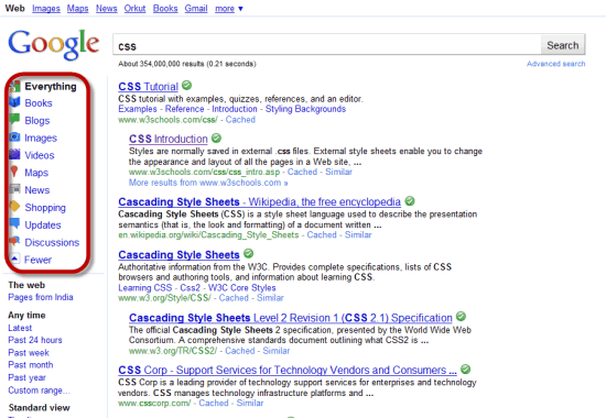
Google has finally joined the icon bandwagon when it comes to the layout of their search results page. I was looking some stuff on Google as usual and suddenly I saw neat icons for Images, Videos, Books, Blogs, Maps and Shopping.
This is something new with Google as usually it has preferred to keep its search layout very sparse and minimal. As a matter of fact this sort of minimalism was what set Google apart from search services like Yahoo and MSN which is now Bing Search.
Why would Google introduce icons?
- Icons are usually considered to be a lot more user friendly than just normal HTML links to introduce a visitor to different services. This may not mean a lot of techies who use Google a 100 times a day, but for the casual search user who is looking up books or the News then these icons could be very helpful.
- Another reason could be Google might be making these changes to suit their usability for Tablet PCs. iPad’s early sales have shown that a tablet will be most probably used by people who use the net for surfing and searching things to buy online. Adding virtual keyboards to search pages also could be with an eye towards Tablet Pcs.
I think this change with introduction of icons is a good move by Google. I do not think regular users like me would really mind the icons are they are not too garish and it might serve its purpose of drawing attention to extra features with Google search which many users are simply ignorant about.
What do you think about this icon friendly Google search layout? Do let me know through your comments.

5 Comments
Only Google india is using this new icon search layout ,google.com not yet using icon layout..
Google.com too showing the icons.
Anyways it looks good.
yeah..It is showing now…It looks awesome..:)
I find it to be very distracting, I liked the older version though
it might be distracting at first by I guess we will get used to it. Thankfully the changes are not too radical.