If you have noticed Google recently, you should have noticed the new interface for almost all products. The interesting part is that all the interface looks very similar to Google plus interface. Google is investing heavily in Google Plus to drive growth in its future on the web. They have big plans for it.
The first re-design that took place was the black menu bar at the top of all its products.
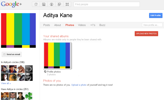
Take a look at the Google plus interface. The tab that you are visiting is show in ‘Red’. Other significant options are highlighted with ‘Red’ prominent buttons.
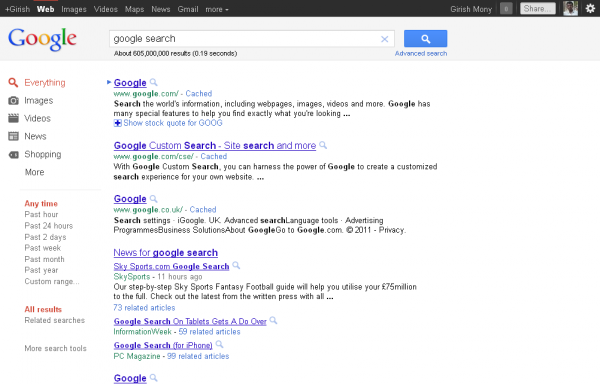
Google Search Layout
Updating Google search interface is not something new. Google repeatedly updates its search interface making the searching easier and more efficient for users. However the latest update, unifies with Google plus. Nothing more than that. Take a look at the screenshot.
- New Google search interface
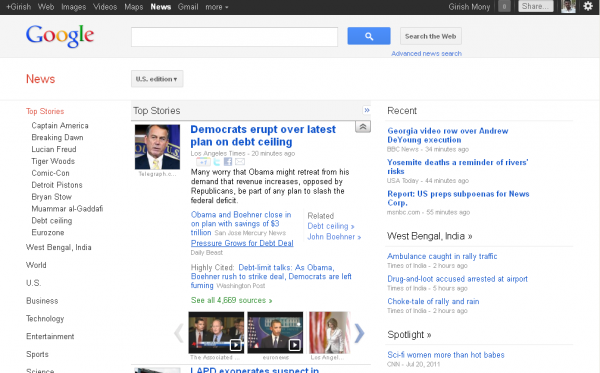
Google News:
New edition is cleaner than the previous one. If you have noticed closely, multimedia contents are more discoverable in this new one.
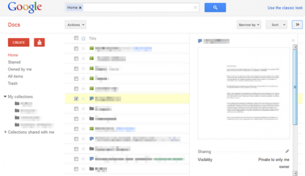
Google Docs
Google added an option to switch to new interface. However you can revert back to classic interface, if you don’t like it.
- Google Docs new interface
This new layout also stays consistent with Google Plus.
Gmail
Google had added the Google plus theme to Gmail Theme library. You can enable it by visiting themes in settings and selecting ‘Preview’ and ‘Preview(Dense)’. Unlike other products, I like new gmail look. It appears less cluttered and more effective.
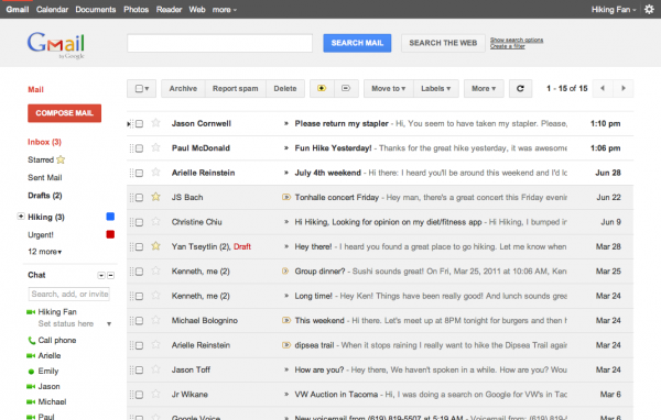
You can read more about that here
Google Books:
Google Books has also got its Google Plus like design update.
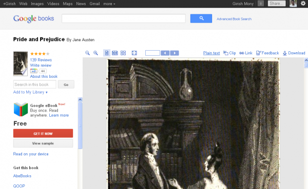
More white spaces now and less space for books, which I feel is not user friendly.
What is behind this unified design theory?
- With Google plus update on all Google product, Gmail looks more cleaner, while other products remains same and Google books appearance gets downgraded.
- Google might be looking to make fans for one service more to another product or service with a lot more ease, as the design and layouts keep things familiar.
- It also might be a way to suggest that all Google products will come together at Google+.
But unfortunately Google products does lose its unique look and some people might get tired of the uniformed design across all Google services.
What are your views on Google’s new design layouts for all its services and products? Do drop in your comments.
Editor’s Note: This post was written by Guest Author Girish Mony. If you would like to write Guest Posts on Devils’ Workshop, join us here.
2 Comments
Google design look is so clean and beautiful but if we should try different looks for all Google products coz all products features are different so we should present that way. Google main theme look is GREAT.
I like the google theme. The problem I feel the most is, I get tired by seeing the same UI across all the products. I hope I am not alone. Thanks Aarti for the comment 🙂