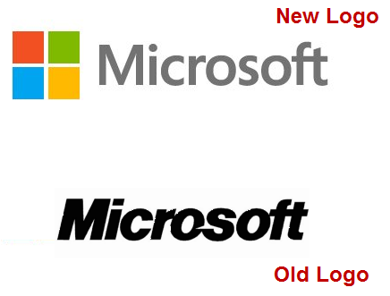
Microsoft might have decided to dump the word “Metro” to describe the UI for Windows but they have remained loyal to the design philosophy in the new minimalist looking logo for Microsoft.
The new logo is a lot more simpler and stylish from its previous iteration.
The new logo for Microsoft was not surprising as it has rolled out new branding exercise for many of its products. The biggest being a new single coloured Windows logo.
Here is a video below which shows how Microsoft has brought about the new logos which have similar style for Microsoft, Windows 8, Office and Xbox.
What are your views on the the new Microsoft Logo? Do drop in your comments.
(via Microsoft Blog)

You must be logged in to post a comment.