Gmail has been recently moving things around with new features. It has recently allowed multiple login feature, new options to create signatures with images and text formatting and also one of my favorites which was integration of Google maps in Gmail. 😉
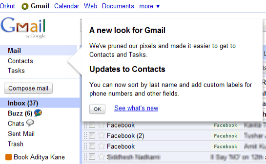
Now they have re-designed the look of Gmail.
No! it is not a sweeping change which leaves a regular user feeling a little lost with something new. It has simply brought about more focus to things like contacts and task along with obviously your Inbox.
So what different from the old Gmail?
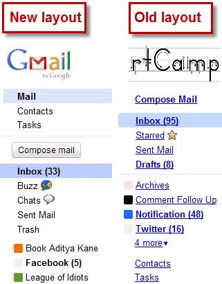
Nothing new from a functionality point of view. I saw that the older layout is active with my work email account which users Google Apps. So you can see the differences side by side in the image below. 😉
- The new layout bring about a change in focus. I guess many Gmail users might not have been aware of the Tasks features and also struggled a bit to find contacts. New layout makes a user plainly aware of Mail, Contacts and Tasks.
- I admit to being a fan of Gmail and I think this might be very useful for users who are not internet savvy to adopt Gmail.
Recently it seems Gmail has started to make itself more user friendly. Almost all its tweaks and chances are more about how things look rather than how their product would work.
Do you think this strategy of Google is good for users or does it take away a bit of charm from Google which was all about being geeky and functional above everything. 😀
Do drop in your comments and views.
Link: Gmail Blog


4 Comments
changes made are good and leads to easy navigation.
Ya its good…!
I agree with Ranga, it’s all good. Even with those changes it’s just the same regular email that just had to make changes in the user interface.
No good; the contacts are all wacky and it gave me a headache trying to make sense of it.