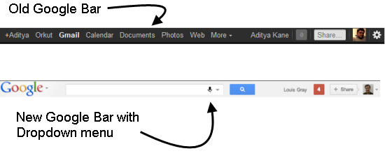
In the past 4 months or so, Google has been busy updating all their products with new design layouts. Firstly Google+ was rolled out a different layout. Google soon brought about similar changes to other services too.
Everyone now has a black bar at the top across all Google products which is visible but not too much of a distraction. Actually a lot of people have never bothered with the Google bar at the top.
Now Google has announced a roll out of a new Google bar which does not seem to be as prominent as the black bar. Actually it looks more like a drop-down menu.
This will make the design of all Google products a lot more uniform than ever before.
Some might not like it, but from a practicality point of view it makes sense. The new Google bar will allow search from any Google product or service being used. The Google+ sharing options too will become more prominent.
Here is a video of the new design change
The re-design from Google over the months as been something that we have never seen before. The uniformity brought together into products and their layout shows that Google is not just leaving it up to users to find interesting features about their services but is pro-actively pushing them to users.
Do you like the new design? Do you find it more user-friendly than before? Do drop in your comments.

3 Comments
very nice to know this info.nice share Aditya Kane .keep sharing 🙂
thanks for the info !!! 🙂 i think even though it is looking something different, it will be of great use !!!
mine is still the same old black bar. . ..:(