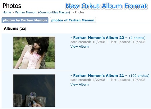
Just noticed some minor but nice changes on Orkut album pages. Looks like Orkut team really got a creative mind on board as few days back they nicely enhanced birthday reminder section on homepage.
Earlier album listing and individiual photo listing in album had same user interface, with 4 rows and 3 columns. It used to create little confusion about thumbnail you are viewing as it could be photo inside album or album cover itself.
Now albums are given more weight and details as they always deserved and result in next to you… 🙂
I guess Orkut can still make use of free space, next to thumbnail on right-side, to give more details about albums. Like total number of comments, or list of people tagged in current album.

10 Comments
yes i checked that after reading your post. Clean one looks better.
After you posted only I went and saw the change. I din’t know! Anyway, somehow I feel the previous layout made better use of space! We have to scroll down to see old albums! 🙁
it was there yest…but its not there now…i checked many profiles, its not there
can`t find it anywhere in my profile 🙁
@Sauravjit Singh –
Guess orkut is doing that phase wise..
Even I found this new feature only in some profiles 🙁
@Deepak
finally it`s in my profile 🙂
@Sauravjit Singh –
hmmm… Good.. Guess you are damn happy 😛
yes I`m lol
cuz every time except this bug,they used to upgrade my profile first
Even I am surprised to see this so early in my account this time.
Usually I am the last one to get updates! 🙁
@Rahul Bansal –
Lolz… Orkut guys must be giving preference to Orkut addicted profiles… 😛 and I guess you are not among that 😉