Twitter is hardly used by regular users from its website. Most regular users probably use something like tweetdeck or other similar desktop apps. But regular users are not really Twitter’s concern. Their big concern are the people who sign up and then simply stop using it because it is too confusing.
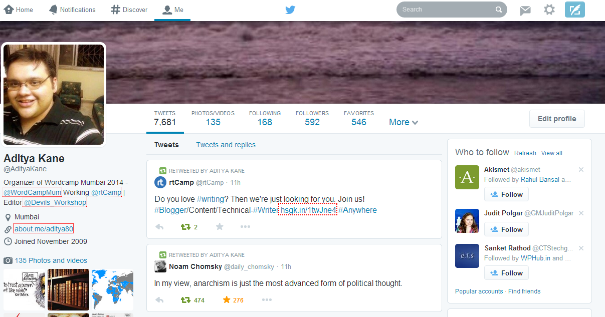
So how does Twitter keep these new users interested on its service? One simple way is to be more like a social network rather than a endless stream of tweets and links. With Twitter new profile design, they have shamelessly copied Facebook’s design.

I would not blame Twitter for copying Facebook. It would give a great deal of familiarity for a first-time user.
That said, I would not enjoy this sort of design on my phone app, which Twitter will probably end up doing because mobile is the future (rather present).
Interesting new feature added is that you can now pin a tweet at the top. This has to be a tweet you posted and not a retweet.
Get the new profile:
- Just log-in to your account on Twitter.
- Visit the link – https://about.twitter.com/products/new-profiles.
- Scroll down a bit and click on the “Get it Now” button.
Your Twitter account will show up with the new profile design.

One Comment
If you don’t like the idea of Twitter bringing this look to the mobile app, you can always use popular third party apps. Robird and Falcon Pro are my favorites. 🙂