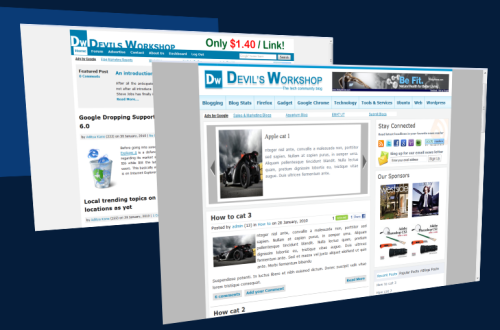
Many of our regular readers are aware that we are working on a new theme for Devil’s Workshop. Yes we are coming closer to completing this project. We have included a lot of new suggestions from our readers who commented and emailed us with their suggestions.
We have tried to include everything that was asked for without trying to change ourselves too much. The endeavor was to make a better Devil’s Workshop and not a different one.

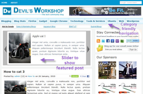
We have tried to keep to retain the familiarity of Devil’s Workshop’s current theme and tried to improve on it with our new theme. We have opted to have a magazine style theme which a lot of readers did want. Personally I think Magazine styled theme does help a great deal to navigate a website a lot more easily.
Homepage features

The new homepage layout will show lesser than 10 posts that we show with our present theme. This is to highlight with excerpts only the latest posts on the homepage. This was a decision which was debated but we feel that showing posts under categories would be better than showing 10 posts on the homepage. This will help make it easier to navigate our website.

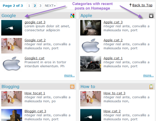
A new addition on our homepage will be categories gaining a lot of prominence. We have got some feedback that using categories for navigating our website has been an issue. This will change as all the categories with some of the recent posts under those categories will be displayed on the homepage itself. The design is still being worked on and you can expect the navbar to have some more additions.
I hope you liked the screenshots of some of the several new changes we will have with Devil’s Workshop’s new theme. Hope you like what you see at the moment.
Note to Authors
If you are a guest author or privileged author with DW, you might want to look up and make some changes with your profile information. As you might have noticed we have stopped the Editor’s Note section for our guest authors as now there is a automated method of doing the same. See image below to check how the new information will be displayed.

As you can see the number of posts show up along with the website address. If you include your twitter account id, a link is generated for readers to get to your Twitter page.
Note that these changes are already in effect and all you have to do is
- Log into DW and get to the Dashboard.
- Once at the Dashboard click on Your Profile on the right hand side.
- Carefully fill in all the details you want to show up with your guest post.
- Ideally keep the biography short only up-to a line as you can see there is a space constraint for displaying the biography with the post.
Hope you all enjoy the new theme and do keep your suggestions and opinion on what you want through your comments.
24 Comments
Great 🙂
I’m already loving the new layout. Hell lot of more colorful and pleasing to my eyes.
Moreover, I liked your idea of taking screenshot with window’s aero 😛
hmm ……….. The layout is good and simple. It will be really good for the eyes of the readers.
New design looks awesome. I like the idea of showing some posts from different categories. I’m also working on something like this but on Thesis theme 🙂
Great..!
i would like to see the ‘DW’ new design as fast 😀
Thats Great..!
New design that you are showing in the screen shots is cool 😀
I really like the design. It’s very neatly done. Hope to see it very soon.
Looks dashing!
New look is great! I would suggest adding some jQuery effects. And are there any plans to shift to WordPress 3.0 when it gets released (it would be having built-in MU feature)..??
Thanks all for encouraging words. 😀
There are few more additions that has to be done on the home page. Please do drop in any suggestion about something that you think is missing on the home page.
Cool!!
yes new design really looking cool 😀
Rahul, for a very long time I was waiting for this. When are you maling it public?
It is some what related to http://KnowBest.info
except categories wise recent Post.
@mohasin
I am glad you think that ways. But I hope your view may change when you see the complete theme.
@Mohsin The theme is pretty much similar to our current one except we have added category wise displays and also a slider. The color scheme at the moment is also pretty close to what we have currently on DW. But the way checked out your blog, looks decent 🙂
@abhishek
The theme is under testing. We are hopeful to get it live soon. 😀
great reDesign nice.. clean.. smooth.. DW..rocks
what plugin are you using for this footer Note to Authors box i like to put in my blog too 🙂
@hr
That is an custom plugin developed by our team. 🙂
A great redesign or i wud rather say a better one…
Gud to see that the logo remains the same… 😉
wat i really liked is the small icons on the category titles, this shows that a lot of detailing is done…
gud work guyz !
Thanks Johnson.
Your new design is simply great… Really glad to see the first look.
I do repeat, “Devils’ Workshop” would mean better than “Devil’s Workshop”. I can see that implementation in the footer note of posts…
Eagerly waiting for the new design, guys…!
This is one of professional and nice theme from DW. Blue looks amazing. I wonder how it will looks with slaty white and black combinations.
Though the work has been completed on the stylessheet, but we will try out these colors. Thanks.
The design looks awesome but the only thing I did not like is the banner ad above header … What do you say ?