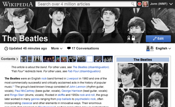
When the whole web is going crazy over technologies like HTML5, CSS3 etc., one can say that Wikipedia is still stuck at their messy look, which is actually true.
Over at Signpost, Wikipedia’s senior designer Brandon Harris, proposes a new and modern look for the site.

Possible changes to Wikipedia
- Design language – Wikipedia calls their new design language as Agora, which will set common icons, patterns, palettes which the community will use here after.
- Mobile-focused – The official Wikipedia app for Android has never pleased me, and their mobile site is no different. Hopefully, this is going to change with mobile site optimized for all screens, including tablets.
-
Better Profiles – Your skills, contributions and participation in various projects will be shown in a neat way in the profile page.
-
Real-time notifications – This can be a great feature for people constantly engaging in projects.
By ‘modern’, if you’re thinking that Wikipedia will become something like Facebook, then you got it completely wrong. Brandon mentions that Wikipedia will never become Facebook or even Quora, for that matter.
Hopefully, the new Wikipedia will make it easy for people to concentrate on the main thing, i.e. content, and collaboration for projects.
A designing agency has even come forward to create Wikipedia Redefined, a site hinting at how one can make Wikipedia modern.
Do you think there’s need for a redesign of Wikipedia? Tell us in the comments.
One Comment
Well, the change is inevitable. Let’s wait for Wikipedia to roll out the new design.