This had to happen and many people have seen this coming. Microsoft is finally trying to address many of users’ common annoyances with a small update to its OS, Windows 8.
Windows 8 had got a lot of criticism that it’s much harder to use than the previous versions and that the change is too drastic. All that is indeed true. Apparently, it’s impossible for Microsoft to completely take a U-turn and get back to Windows 7. So, now they’re trying to appease users by making it a little less confusing.
Here’s the new stuff Microsoft’s releasing with Windows 8.1.
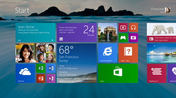
Bring that Start button back
Personally, I never really cared about the lack of Start button in Windows 8. Though, that’s not the case with most mainstream users. So with 8.1, MSFT is bringing the Start button back. Yes, for real. But only the button. Nothing more.
If you hit the button, you’ll be taken back to the Start screen. Something is better than nothing, right?
Also, for all you Start screen haters, Microsoft has added a nice new feature to 8.1 and that’s boot to desktop. It will be off by default, but I’m sure there’ll be many users who will search for it and switch it on.
Do more inside Metro
How much ever Microsoft tries to push Metro apps over desktop apps, it’s not going to change the fact that Metro apps suck. All stock Metro apps in Windows 8 are going to get updated, that includes Maps, Photos, Mail and etc.
Also, you can do a lot more customisation using Settings app itself, instead of relying on Control Panel. Again, it’s just Microsoft pushing Metro apps.
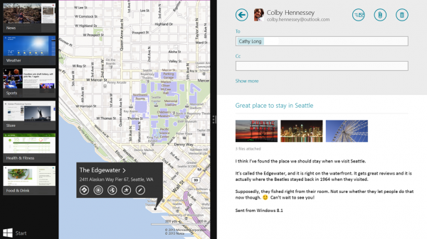
App snapping has improved too. If you have a multi monitor setup, you can now snap 3 Metro apps. You can also snap windows of the same app. Think of viewing two websites loaded side by side in two Metro IE windows.
Apart from these, there are small improvements like you can now search Bing through the Search feature in Charms bar. Windows Store, the ghost town, is updated with a better UI and more information and charts related to apps.
It seems like the update will be free for existing Windows 8 users and will probably made available in the Windows Store itself. (think OS X Mountain Lion)
Can these improvements make Windows 8 less irritating for you? Put that in the comments.
Source: The Windows blog


4 Comments
“Can these improvements make Windows 8 less irritating for you?”
Nope. Because I don’t find Windows 8 irritating. Once you get passed the Start Screen, simple push of a button (Windows key), you’ll find it behaves almost exactly like Windows 7. I already liked Windows 7, so I’m fine with that. And when you think of the Start Screen as a replacement to the Start Menu, you come to realize it’s way better. Because there is a lot more customization and organizing you can do (that is more straight forward) than you could on the Start Menu. The Start Menu was always filled with a lot of stuff you never used, whereas the Start Screen can be only what you want. It’s like browser bookmarks for your local machine apps, which is nice. And then, when you consider you can simply start typing on the keyboard to start a search among Apps, Settings and Files on your local machine… well, almost everything is a click away (or closer). Really, what it’s done is it has made the Windows OS more customizable. And coming from someone who can’t stand desktop icons, I always hide mine, it’s a nice touch.
I certainly welcome improvements to Metro, as some apps need them. I have done my part there by providing feedback, helpful feedback. But what fool here will say that every app they ever downloaded from iOS or Android worked like a charm?
I suspect things will only get better for the Metro side of things, and I’m cool with that. I look forward to the update, just as I would any software update, because with it comes improvements. What I don’t look forward to is stepping backwards (adding a Start Menu button). I hope that’s optional, because I don’t need it anymore.
“How much ever Microsoft tries to push Metro apps over desktop apps, it’s not going to change the fact that Metro apps suck”
I don’t think so. In fact I am loving some of the apps like Finance, Skype etc.. They have replaced my desktop counterparts. I agree that soft-wares with many features like Photoshop etc cannot be moved to metro apps as such but it can have beautiful apps with simple applications and I think Windows 8 is making good progress in right direction.
I don’t use Skype, and I don’t invest in stocks, either. The apps I use on my Mac are a Twitter client, a browser, an RSS reader, a code editor, a music player and so on. Metro apps need to be “full screen” and it makes no sense for all these apps to be full screen.
Take example of Twitter’s Windows 8 app. It makes no sense to use that app on a desktop. It just looks weird to me. (MetroTwit is a lot better though).
BTW, you have a good point about “simple applications”, but here’s the thing: the average audience no longer need ‘apps’. The browser is everything. That’s what Google is trying with Chromebooks, anyway.