Today as I woke up in the morning and checked out my Twitter feed, there was a huge buzz about Carbon which is a new Android app for Twitter. That caught my interest as I use an Android phone. I am not the biggest fan of Twitter’s own app for Android and TweetDeck is pretty much dead on Android.
So I installed Carbon and I was delighted. Its beauty made me think of another beautifully designed app called Any.do which is a To-Do List app. But that delight lasted for 5 minutes, as I pretty soon found out some very big limitations with Carbon for Twitter.
Carbon for Twitter on Android – Features
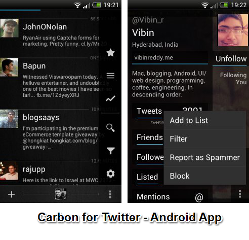
- Carbon is possibly one of the best designed apps that exist on Android. It is fluid and intuitive design wise.
- I found that it allowed me to look through my timeline, mentions and DM with extreme ease with a single swipe motion.
- I found users could be easily filtered out from the timeline by going to their profile and selecting a filter for them.
Now the part where Carbon App for Twitter disappoints:
- It shows mentions but completely hides retweets.
- Most importantly it does does not support streaming of Tweets and has no support for push notifications.
- And one of the worst feature of it for someone who loves looking up lists on Twitter is that it makes your look toggle through lists by looking them up in the menu.
I think Carbon for Twitter is not really a great app for Twitter. If you are planning to use it as your primary app on Android, then I must warn you it is barely functional. Though this app is not available on tablets, I think it would be a lot better on a tablet screen than a phone. The lack of functionality make me wonder if they will be rolling out a pro version that is paid.
Hopefully this app gets more updates and gets a lot more functional. If it does not then all the effort into a beautiful design will go to waste.
Try out Carbon for Twitter on Android and drop in your comments.
Link: Carbon for Twitter


2 Comments
Carbon was initially on Windows phone and it was a great app. But now they have stopped supporting windows and jumped to Android for obvious reasons. I hope to see lots more updates from them in near future.
I sure hope so. I have not yet uninstalled it form my phone only because its UI is so pretty.