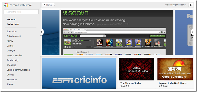
Being a Chrome junkie, I often check new apps and extensions at the Chrome Web store. Like everyday, I checked Chrome Webstore today and what I’ve noticed is, it has got a clean redesign, probably built heavily on HTML5 (as web store does not have to support older browsers). 🙂
The homepage now features best rated apps (in your country) in the header and then followed by endless number of apps, everything on the same page. You can now install any app/extension by just hovering your cursor on any thumbnail and a click on add to chrome. The navigation bar on the left side is sticky.
Click on an app to get more info, in a new window, where in you can have a tabbed view of details regarding the app. Some of the app collections like New Additions doesn’t work anymore making it hard for bloggers to find new apps/extensions.
Google also adds two customization features, one is the ability to change the location and another is multilingual support. Click on settings icon (make sure you signed into your Google account) > Location > Choose any location you want.
This is useful if you want to see what extensions are popular worldwide, not just your country.
The interface looks more suited for touch screens, but there seems no reason for it tablets do not run Chrome.
Do you like the redesign? Tell us what you think.
Link: Chrome Web Store

2 Comments
They are updating everything too match Google+ they want to integrate evrything with google+
Nope, this is not a Google+ -inspired interface, rather it’s optimized for touch and again there’s no meaning in integrating it with Google+, except that it has +1 buttons all over the webstore.