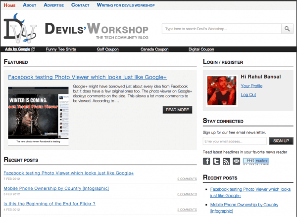
As some of you might have noticed, our Devils’ workshop got a new logo & design. 🙂
Last time we redesigned DW was almost 2 years back. In 2 years, WordPress has evolved so much that we couldn’t keep updating DW theme at faster pace. We have too many sites in our network and separately updating each for latest WordPress features was a tough job.
But with this new theme, we are moving all our sites to our new open-source theme framework – rtPanel. This and all future themes will be developed as a rtPanel’s child theme. This means if we add a new feature into rtPanel framework, it will be available into all rtPanel’s child themes (unless somebody abused child-theme development guidelines!)
New Design, New Goals!
With this new design, we have some new goals. A lot is changing about the way we operate DW. Some of changes might be shocking!
LESS Advertising:
DW will use Google-AdSense only for now onwards. If we decide to consider other ad-network, it will be BuySellAds. Apart from AdSense, we will only consider direct Banner-Ads sales.
We have made some decent money from Technorati, Kontera and some more networks, but these networks uses blocking-javascript which degrades performance of our pages. So we are bidding adieu to all of them!
LESS Social (networking):
We have decided to show social icons on single-posts only. No more cluttering archive pages with literally 10’s of social-icons!
For small-social stuff we decided to keep here, we will use our own rtSocial plugin. rtSocial is very low on resources and while developing this theme, we found few more ways to optimize it in future release!
Going anti-social will personally help me focus more on content-part and also community of guest-bloggers & readers here.
MORE (Quality) Content:
The moment we removed ad-networks which were bloating this site, I realized that we no longer run DW to make money only!
Once slow-loading ads were thrown out, next target is poor content! We are working on streamlining work-flow for guest-bloggers to make it easy for them to contribute to DW. This will raise quality-bar of posts here IMHO.
MORE Community Oriented:
We will be bringing back long-abandoned DW support forum back. Support forum will help us answer reader questions as well as questions from guest-bloggers. We will continue to answer questions on twitter and our facebook page but support forum will have highest priority.
We are also experimenting with some WordPress comments enhancement plugins. Integrating with third-party system like Disqus/IntenseDebate is also into consideration. The goal is to make it easy to comment here!
Credits!
I already received few emails praising new DW logo. The credit for same goes to our design team lead Sneha Mutha. Sneha created a nice new design also, which is slightly different than what you are seeing here.
We coded many things on live DW server so that we can have first-hand experience of issues that other developers might be facing while working on rtPanel theme framework. Our senior developer Joshua with Prakash and Nitun will keep optimizing this new design till we don’t get it right!
As always, we love to hear your feedback & criticism via comment form below. 🙂


11 Comments
Hi Rahul,
Liked the new theme…
But the landing page of the adsense links below the header has the same black background which does not look good, according to me atleast.
Your new Devilworkshop design is cool. I liked this.
I liked this theme specially the header which was not that Petty, but it now look awesome. New Good logo and the improved good looking search bar. Author information with gavatar is also a cool feature. Addtion to that Login is great.
One question i have, will the featured post at home page will show the latest post or what? I have doubt about it.
nice clean interface to navigate to your post especially your logo is rocking
Nice logo and design. But i have a small suggestion.http://3.bp.blogspot.com/-FOQvP1mJNW4/TzKZ_gfLZkI/AAAAAAAAAsA/iPsD1WjUsdc/s1600/Devils.jpg Have a look at the image contained. I think that should increase readability. If you don like it just see off.
Hey thanks for nice suggestions. Specially regarding background. I really liked shadow/box effect as compared to current dark-gray solid background. We will definitely try your suggestion. 🙂
Nice logo… But I would still prefer the old layout. 🙂
Don’t you think so that the content is pushed much more down due to adsense and that share box??
And do justify the page content so it looks more clean!!
I personally didnt like your new Logo.
Hello rahul,i already discuss about your new logo in past .. now your starting word is really awesome ” Dear Devils ” 😉 yes we are devils .. Tech devils man .. you rocks .. .
Yep, I remember our discussion! 🙂
The new layout looks awesome.. damn.. loving it to the core.. it is really clean…