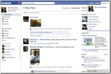
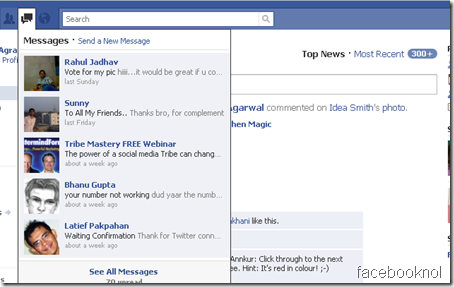
Facebook Updated the new design and they named this project internally as Titan project. Any one who can see Facebook new interface can easily figure out lots of changes at one go. The major difference in new interface is accessibility. On Internet world, less click means more page views and more time on Site. In the new Facebook design, designers focused more on reach ability from one tab to another with less clicks.
For example in Previous version of Facebook we need to go to message tabs to see all the unread messaged and similarly for Friend request. In latest design, this can be done from home page of Facebook.
More Space for Facebook Chat :
To be honest, I don’t like Facebook chat because its slow and always disconnect in slow broadband speed. Though this is about new design and latest facebook design has given the same right bottom bar space but made it less cluttered.
One significant thing added by facebook is Friend online feature on the left hand side. You can quickly click on the name and start chatting.
Bottom Bar Moved to Left sidebar
Another major noticeable difference is removal of bottom bar and moved it to left sidebar. This will give more space for applications .
In my opinion the new interface is designed to make Facebook more interactive.
Do let me know about your opinion about new Facebook Interface.


3 Comments
Is it out yet ?
Is there a way to change to the previous version if I have a Mac OS? I really don’t like the new facebook.
Thanks… 🙂
yea its cool……..new facebook is nice and loads in the same page without loading the full page while reading messages and all,but in order to get new message notification while chatting through messages u have have to reload the full page that is not good.