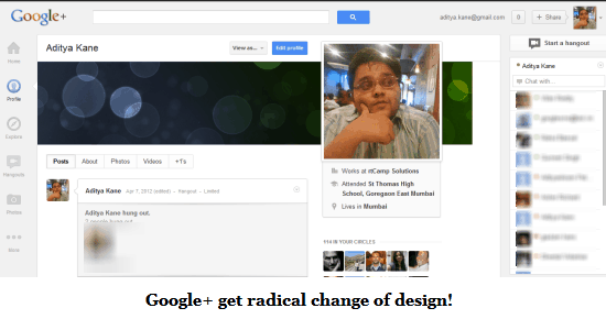
Redesigns are always a tricky part for any social network. Last year when Google+ was released, Facebook reacted with Timeline and a complete redesign. Google+ is often called a better designed clone of Facebook and it is living up to that identity by rolling out cover photos for Google+ profiles.
The new design has also made Google+ features (which were probably under utilized) a lot more prominent by sticking the icons to the left hand side of the page.
The new design is pretty decent and probably needed as Google+ was looking a little incoherent with it’s previous design. The fortunate part of this new design, is they have not touched the features or privacy options. This was one of my biggest grouse against Facebook, whenever they opt for major changes.
That said I wonder if Google+ did the wise thing by copying Facebook’s cover photos feature. The cover photos feature on Google+ is a sure sign of Facebook still setting the trend among social networks while others are still catching on.
Here is a video of the new Google+ design
I am not sure how many Google+ fans will get angry over the new design. When Facebook changed their design quite a few did not like Timeline at all, as is evident from comments on this post.
What are your views on the new Google+ design? Do drop in your comments.

4 Comments
This is what a developer had to say
“Facebook never did stuff like this, never forced us to change layouts like this. They have given the users a transition period to use the new layout. They always presented us a transition period to try the new layouts in a BETA sandbox weeks before they release it to the public. Allowing us to fix and comment, and iterate”
Read it here:
https://plus.google.com/116805285176805120365/posts/PZ1RG1QV1w7
Interesting point. The developer is right, there should have been a short transition period atleast.
“Allowing us to fix and comment, and iterate” – True. But the irony is, they don’t fix things. 😀
But I would say that G+ is clean and minimal now in comparison to FB!Missing the ol’ FB :/