Apple has finally unveiled its much anticipated next generation of iOS at WWDC. Apparently, due to the rumours that circulated for months, people expected a radical change – nothing surprising in that, it happens at every WWDC event.
But what’s surprising is, this time Apple has actually delivered. iOS 7 is indeed the biggest change to Apple’s mobile operating system.
The biggest change is of course the change in user interface. Talking about design, it’s like they started all over again.
If you’re a long time iOS user, you’ll be surprised to see that there are no faux wood, leather, stitches and other skeuomorphic elements. The new interface looks minimal, focused on content – it’s great, on a whole.
But it’s buggy, it feels like Apple’s design team has rushed to ship this product. It doesn’t feel perfect. Here’s why.
Not exactly Flat
This is not a bug, this is a misconception from people.
Flat design. If you know very little about design but want to make up stuff, this is the best way to do it – call everything as flat design.
Flat design has been a trend in graphic and web design for a while now, and there’s nothing wrong about that. What’s stupid though is, complaining everything as flat.
iOS 7 is not exactly flat design. Few reasons:
First up, in Flat design, gradients don’t come into picture at all. The icons in iOS 7 have gradients as background. Some of those gradients look lame, but yeah, they exist.
iOS 7 shows off a new thing called Parallax effect – it creates a 3D illusion on your iPhone when you tilt it. There’s no way 3D illusions can come into flat design.
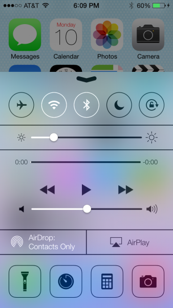
Transparency is everywhere in the OS. Pull the Control Center from down and you see the transparent rainbow colours as background. Again, transparency doesn’t come in Flat design. That’s the reason Microsoft removed Aero from Windows 8.
Now let’s see what Apple has got wrong.
Icons
Icons are the worst thing about iOS 7. There’s just no sense of unity among them.
Take a look at Mail icon – there’s a gradient going from dark blue to light blue (cyan). Next see the App store icon, the gradient goes from light blue to dark blue.
Opposite gradients, seriously?
That’s not all, thought. Take a look at the Phone icon. It looks there is a solid colour as background, right? No, it’s a gradient. A very subtle gradient. Then there is the Camera icon which looks like clipart.
The Stocks icon looks as if the colours are inverted, and the Settings icon doesn’t even look like a gear.
Apple says they have put a lot of effort and made all these icons on a new grid
system, which is nice, but they looks plain ugly.
Control Center
Control Center in iOS 7 is very exciting. That’s because you can quickly toggle settings without opening the Settings app. But let’s look at the design.
At the first look, it looks beautiful. As you start examining closely, you’ll get a doubt on whether you’re looking at an Android ROM. Because, there are so many settings in this very single window.
There are two types of icons here – the first ones are circular and the second ones are rounded rectangles. There are three sliders here. Three, I repeat. One for brightness. One for volume. And the last one for Music. Seriously, Apple?!
Also, who needs a Camera inside this, when you already have it on lock screen? Also, I have no idea what that second icon in the last row means. A timer may be? I don’t know. The calculator app is pretty useless, too.
Also, while we’re at Control Center, it’s important to notice that the new Notification Center still doesn’t fix the small x’s. Enjoy tapping those minuscule buttons.
Consistency is missing
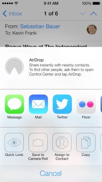
You’ve just seen the design of Control Center, now take a look at the design of Share feature.
Why are the icons drawn as outlines? Why not draw them as filled ones like Control Center? Also, even the stroke width seems to be lesser. The Camera icon doesn’t convey any meaning, it doesn’t look like a Camera at all.
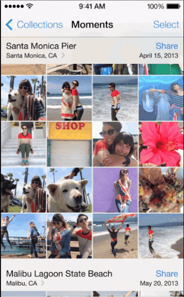
There’s no consistency in buttons. Take the Photos app for example, here you have Select and Share buttons at top right. Yeah, those are buttons, not pieces of text (Hello, Windows Phone!). Buttons in iOS always used to be distinct – with a unique gradient and shadow. That makes it easily distinguishable. Not anymore.
These buttons co exist with “Install” buttons in App Store which look like the old buttons.
At the end of the day, iOS 7 is still just a beta update. The design community largely being consistent of iPhone users, I’m sure (or at least hope) Apple will take suggestions from them and fix these things in the stable release.


4 Comments
Haha… I can see your pointers but I would say the new UI is flatter than previous versions – instead of calling it Flat.
They also might mean the same.
Also – its just a beta 1. So… we never know what they might change till October.
Good views though 🙂
iPhone is popular with people who want to appear upscale and professional. That means all the graphics should look so good they must have been designed by professional graphic artists. But the new icons and layouts look like they could have been designed by anyone’s kid for a school project. Seriously, it’s the flagship product of the richest company who recruits the best talent — and THAT’s the best they could come up with? Apple may follow in BlackBerry’s footsteps if they aren’t more careful, that cocky “we’re king and can do no wrong” attitude is what killed RIM.
Thanks a lot for sharing this post and letting us know about the various features of iOS 7 beta: Apple. Although there are a lot of problems in it but I loved the Control center that this gadget is having. It’s simply amazing.
Wow! iOS 7 beta launched by Apple is amazing in terms of look, design and everything. I loved this new operating system launched by apple. Thanks a lot for letting me know all about it. I am really excited for this one.