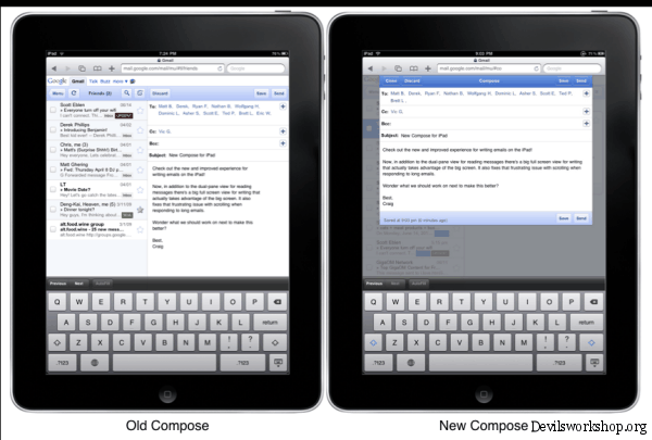
Google has unveiled their new Gmail interface for iPad users, taking their first step on Iterative Web App series which will continue to release features for Gmail for mobile. Now for iPad users the compose interface has been redesigned.
Apple iPad users would now get an updated email compose screen which appears as an overlay providing more space for writing the message.
The official Google statement says
” When you write an email you’ll now get a big full screen compose window instead of splitting the screen between your inbox and the compose view. More text is visible at once and there are no more distractions with messages on the side. Also fixed problems that prevented scrolling on long messages. ”
As of now, the new interface is only available for US English.
You might want to read How to get Gmail’s Tablet interface with Chrome.
You can actually play around with the same user interface on your desktop. Apple Safari 5 now comes with an option to render pages as Apple iPad.
What are your thoughts on the Gmail design for iPad devices? Do let us know through your comments.


3 Comments
great feature
It’s a great thing that different web apps are coming up with their own version for the iPad!
I love every aspect of gmail!thanks