 The folks at Google have surely been kept busy over the past few months. As Google+ is setting the internet on fire with a mad rush for new invites for checking the new social media product.
Google is convinced that they have got a killer design with Google Plus, and hence are moving to make Gmail look a lot more like Google+.
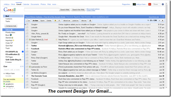
The Current Design of Gmail
The current design in fine. As someone who uses Gmail everyday, I like the current design was a little concerned what the new design would look like.
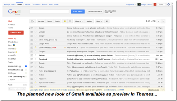
Gmail offers users to change the theme at Settings >> Themes and select the Preview Themes which give a good idea of how Gmail will look in the future.
The planned design for Gmail
The new design plans to make Gmail more easy to use, with the user interface becoming a lot more cleaner. Users might not be happy with such design changes as most times, people are used to a particular design and have some sort of visual memory that can make them resist the idea of a new design.
Google will be rolling out new design and features across all Google products to make it more social. It seems this time Google will leave no stone unturned to make sure it cracks the social media puzzle.
What are your views on the design plans for Gmail? Do drop in your comments.


4 Comments
The new Gmail Themes are awesome! Simple and Clean design. But my desired username is not available 🙁
Yes, I found the new design very clean and it seemed to return to its roots of simplicity.
I really like the new design. It’s very clean and simple. This design looks similar to the Google search webpage. I suppose Google is trying to keep the same theme across all it’s products.
Liked the Refresh Button and the white space all around :-).
Seems like Google started loving Grey shades!