After more than 4 years, I guess, Google has finally revamped blogger’s favorite advertising network Google AdSense.
I just logged into Google AdSense to see new interface waiting for me. Below is screenshot of our new Google AdSense dashboard…
(click on image above to see it in full-size)
I will update this post once I am done with exploring new AdSense user-interface. Updates are added below now.
New “My Ads” Section
New ad-units management simply rocks. Its neat, clean, easy to navigate and extremely well-organized. (See screenshot below)
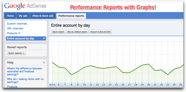
Performance Reports with Graphs!
I hardly get time to check our Google AdSense account, but as far as I remember old AdSense didn’t have any charts or graphs in performance reports section.
New AdSense interface adds graphs to performance reports on similar lines like Google Analytics! Means you can select timeline and configure reporting parameters with simple clicks!
Overall…
In any interface redesign project, generally we need some time to get used to with it. Here I see absolutely zero learning curve. It’s so intuitive that in less than 10 minutes I got comfortable with everything.
Also thank you Google for giving me early access to new adsense interface. 🙂
You can read more about new AdSense interface on official site.


16 Comments
Still w8ing for it!! :/
Still Waiting!
Can’t See the new interference in my ac 🙁
Blur your email ID and PUB ID in the first image for security reasons…
@Bapun
Did it. Though, I think we no need to hide publisher id as it can be taken from source code of a webpage.
@Sauravjit, Pranav: I guess Google is slowing rolling out this feature. I have been using this new Adsense interface since last 3/4 months and I did not make any post on this on my blog as I thought Google made it available to all publishers the same time. But no, they are taking their own sweet time!
I am still waiting for it !!!
I think Old one is better
ya very interesting,thnx for sharing.
Is it the original image you posted ?? 😛
$325,234,434,567.07 in a day lolzz… i even can’t dream of it 😛 😛
Image is original with numbers altered.
I blurred all numbers first but that way screenshot was looking ugly. So modified source code of webpage and then took screenshot. 😀
the old interface was good though.
Loved the whole graphs and the way reports are generated. I’ve been using this new interface from 7 days..
hey dear, i want to know all realted details i.e. owner name and address details of a cellphone number, tell me if u any guide for me. Thanks.
Woah Earnings !!!
Also google is trying to roll out the new UI for FeedBurner !! check out 🙂
The new interface is not at all good, old one is much better
Sorry to say but the old adsense interface was better, we all have our time to make money not to try to figure out a new interface, hopely they don’t change it again 🙂