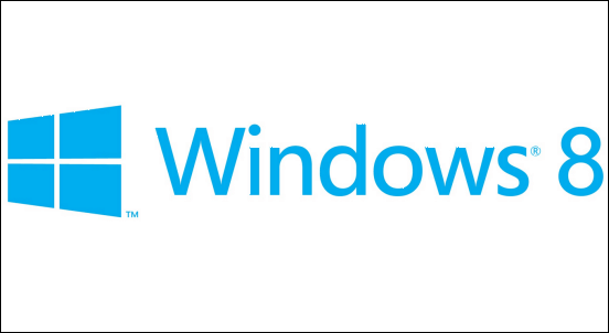
Logos are probably the most important identity of a brand. That is why even when companies change their logo, they do not opt for a complete break from the past. As you might know the Microsoft is busy building Windows 8, which might show up on tablets, mobile phones and PCs later this year. Microsoft has been developing Window 8 with metro-styled tiled layout. This is astheitcally very pleasing and having uniformity in user-interface across different devices is a good idea.
Microsoft today unveiled the new logo for Windows 8. It is going to raise a few eye brows as it has done away with the 4 coloured flag logo and opted for a single coloured logo.
Windows Logos through time
Here is a quick timelime of all the previous logos for Windows. It is interesting to note that with the Windows 8 logo has a lot of similarity with the logo of Windows 1.0.
I am not certain why they did away with the familiarity of 4 coloured scheme but I guess a simple logo with a single color scheme would make it a lot easier for manufactures to print the brand logos on mobile phones and tablets.
I sort of like the new logo but not sure how it will look on the OS. What are your views? Are you happy with the new Windows logo?


10 Comments
Take a poll on Facebook! 😉
Thanks Dnyanesh. I just took up your suggestion to take a poll on Facebook.
I hate…. but no option for us other that accpect it..:)
I like the new logo and the great job done by Pentagram design team. The logo is surprisingly modern.
Dull logo…
When the logo has only one color it shld atleast have a good design…
Thumbs down MS…
I like this logo, its nice and decent.
I really don’t like it . looks like microsoft going down in design . just a box with ordinary text 😛
I like this new logo. It’s a awesome.
Its a classic logo…although not very stylish neither innovative…
its just OK….!
No i dont like this logo but no option for us other that so have to accept it 🙁