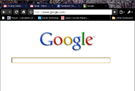
I recently came across a lot of articles online about how Google has experimented with a minimalist look to its homepage. For people who are not aware of it as yet, the new experimental look has only the search box visible along with the Google image. No links or buttons are visible until you move the mouse. 🙂
Below is a screenshot Google’s new avatar.

This seems to take the concept of keeping things simple to an extreme but if you really went back to the amazing rise of Google Search, keeping it simple has been a long-term tactic for Google.
Simple Vs Complex
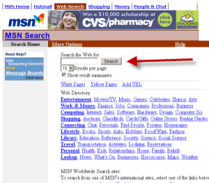
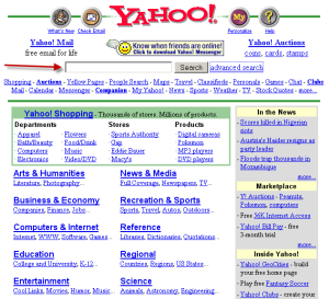
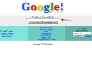
What I did was use the Wayback Machine and check out search websites and how they were back in the year 2000. Below are the screen-shot images of Msn Search, Yahoo Search and Google.
msn.com in Year 2000

Yahoo Search in Year 2000

Google beta in Year 2000

- If you notice that Google had the least number of hyperlinks on its homepage even back in the year 2000.
- Keeping things simple meant Google concentrated on how to improve their search engine mainly, while MSN and Yahoo toyed with various features and indexes.
- Keeping a simple interface means people using it are not too distracted while using your website. This is not just true for search engines but for any service or product.
- Google did the right thing back then by keeping its focus on a lean but comprehensive product. Simplicity has helped it become the giant it is now and the latest “Minimalistic Avatar” is a welcome sign.
At the end of the day who does not like a smart and simple interface? 🙂
2 Comments