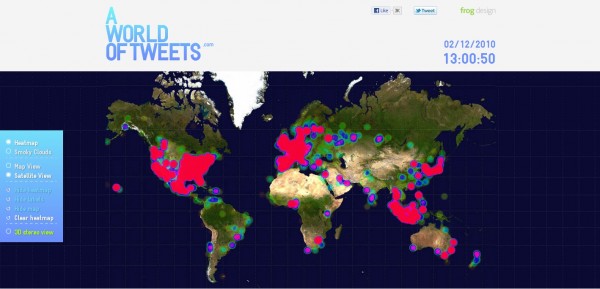
Twitter has become the world’s most used micro blogging platorm today and the number of people using twitter is phenomenal. To demonstrate the real-time frequency of tweets, Carlo Zapponi and Andreas Markdalen came up with an incredible idea that puts all the tweets on the map, literally !

The above screen shot is the actual visualization of the tweet-frequency from around the world. The red color you see in some areas, increases with the increase in the tweets from that particular region. They call it the heat-map.
I had this website running continuously for 2 hr 17m which produced such a massive result of tweets as evident from the screenshot. When you visit the website yourself, the visualization will begin with a clean slate and will start to fill up gradually as time progresses.
There are 2 visualization options: the satellite view and the map view. You will find some mind boggling statistics at the bottom of the visualization.
Try it yourself :
- Open “A world of tweets”.
- Login to Twitter.
- Tweet anything you like.
- Switch to the “A world of tweets” tab as fast as possible, by using Ctrl+Shift+Tab OR Ctrl+Tab if you are using Google Chrome.
- If you can see instantly that a tweet got processed from your country, then it was you!
Do try it out and let me know through your comments.
Link: World of Tweets
3 Comments
Congrats for your first post Omkar. Looking forward to read more posts from you.
Congrats for your 1st post, anyways Omkar nice artice
Hey Thanks a ton Vivek and Huzaifa !