A logo is very important as an identity for a company or a brand. A logo ideally is expected to be creative and interesting. Many companies do a lot or research and take efforts to come up with that one awesome logo which signifies their company. Most times such logos say something more than what appears to be.
Here are some interesting logos of brands and learn about hidden meaning behind them. 😉
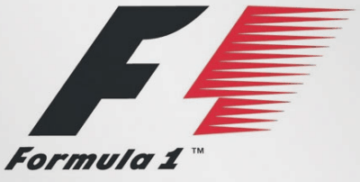
Formula 1
The logo at first glance looks quite simple and boring. But give it a closer look. There you can see the symbol of ‘One’ inside the blank space between ‘F’ and red colored ‘1’.
Link: Formula 1 Logo
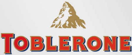
Toblerone
Toblerone is a company that makes chocolates. It originated in a place called Bern, Switzerland. This place is called the city of bears. You can see the outline of a bear on the mountain. Try looking for a standing bear. 😉
Link: Toblerone Logo
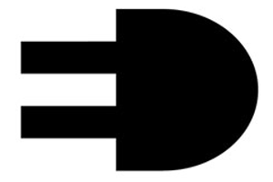
Elettro Domestici
ED is an Italian company into domestic electronic appliances. This logo of ED shows a black colored electric plug. But the contracts with white gives the illusion of the characters ‘E’ and ‘D’.
Sony Vaio
The Vaio logo also has a secret. The ‘va’ part represents the basic analogue signal and the ‘io’ looks like the binary 1’s and 0’s.
Link: VAIO
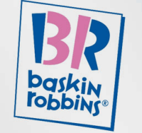
Baskin and Robins
Baskin and Robbins is famous ice cream brand. It has 31 flavors of ice-cream. The logo shows the letter B and R. Just looking at the pink part of the logo will show the number ’31’.
Link: Baskin and Robbins
Amazon
The logo for Amazon shows a smiley. Along with that the arrows show moves from A to Z. This logo symbolizes that they sell things from A to Z. 😛
Link: Amazon
Continental Tyres
Continental is a company which sells wheels. At first glance it looks like the simple word ‘Continental’. Look at ‘C’ and ‘o’ closely and you will see that it creates the illusion of a tyre.
Link: Continental Tyres
So these are some of the logos around with some hidden meaning. Next time you look at a logo of a brand, spend some time to find some hidden meaning. You might be surprised at what you see.
Do drop in your view through your comments.


27 Comments
Nice one Adi!
nice post adi, but i request to cite the source from where u come to kno abt, as i hav already seen this 1 elsewhere….. its bloggers ethics to promote each other… no offence
Came across most of this info on a email forwards. If you can provide a source I ll be happy to add it on the post.
Nice post mate & I like the secret behind VAIO, it was really awesone.. 🙂
hey that’s cool. I have noticed some of these logos, but you have great eyes…..!
amaazing dud…..
wow ,very good
Interesting !!!
superb no way to express the greatness of this site
great post!! following f1 for a long time but never figure out this secret
Truly good examples of creative logos.
great post man. never thought of these. these symbols are really well thought.
great !!!!!!!!!!!
it’s very helpful for designers………thanks for sharing
Hi it is nice to know the stories behind the logos.
nice 1:)
what about indian logos bro?
Well there are many good indian logos around but not many with hidden meanings. Maybe I will have to search for it and come up with another post. 😉
well ..!!!! lets decipher APPLE..!!!
1. THE WORD APPLE IS THE FIRST WORD TAUGHT TO THE CHILDREN…. LETS SAY BEGINNING OF AN EDUCATION OR LEARNING. A FOR APPLE..!!!
2. THE LOGO SYMBOLISES THE APPLE HALF EATEN …. remember the old story of ADAM and EVE… apple is the fruit that gave man his wisdom…..it is the beginning of everything… the most simple and sober logo i have ever come across.. yet most meaningful.. like some of the ROBERT LANGDON STORIES..!!! hats off.. no matches… what say..???
About Apple logo – lots to say : the half-eaten apple is also man defying god (at the time Apple got its start, IBM was god with more than 70% of the world computer market). Also, the original apple logo was made of horizontal stripes – stripes was the sign used for centuries to identify prisoners, prostitutes and other outcasts.
and here is the google….
..–> originating from a misspelling of the word “googol”, the number one followed by one hundred zeros, which was meant to signify the amount of information the search engine was to handle….
Your article is nice. Here after no one assume any wrong meaning to any of the above logo.
Thanks for the comment Abigail. Hope you like more articles on DW. 🙂
Valuable.. thanks.. 🙂
That is a awesome list of logo’s and their names. I wonder what story does Windows logo has.
your article is very nice and secret behind VAIO i like it
The windows logo: nowadays it looks like like flower petals but back then it was simple, just the straight meaning of windows as you can imagine simple a window with four squares.