Kontera, a top ad network famous for its in-text advertising changed the way ContentLinks are displayed. ContentLinks are double underlined keywords which are linked to ads on the fly.
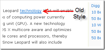
Below is screenshot showing old format where keyword was underlined with two-solid lines.
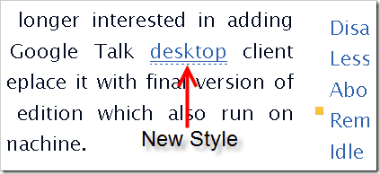
Now a new format is in action as shown below, where instead of two solid lines, one solid and one dotted line is used…
Both of above screenshots are taken today. It seems Kontera is experimenting with this new link style. There is no option to control styles from Kontera publisher center, atleast at the time of writing this.
But this new style will more likely to grab visitors attention and may result in higher earning. Good for publishers! 😉
Link: Kontera


4 Comments
Good Tip! Thanks
KC
@KC
Welcome buddy… 🙂
hmmm interesting !!
@Gagan
Yep… more is on the way… 😉