Facebook is doing some minor changes with its User Interface (UI) and this time it is the friend’s list for chatting. Yes they are continuously modifying their design and the main reason behind this is not to make Facebook look better, it’s just to reduce the disk space usage on their servers and to make the page speed faster.
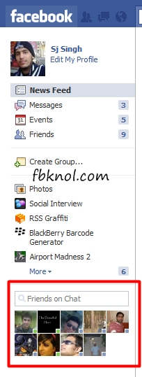
The recent change in the Facebook Chat is that the homepage will not show the names of the person who are online, rather it will show the profile pictures only and to check the name of the person, you have to rollover your mouse cursor on it and it will display the profile’s name.
Also you will see a small dot with an online profile’s picture which shows whether your friend is available to chat or he/she is idle. A green coloured dot means your friend is available and blue coloured means he’s idle.

There’s also a new ‘Friends on Chat’ search box where you can find your online friends by name if you can’t find them by pic or if you have a huge list of friends. Personally I don’t like Facebook chat much cuz it’s full of technical bugs but most of the Facebook users are addicted to it so do tell us whether you like it or not????
2 Comments
Even I noticed this new feature three days back. This one looks good compared to earlier interface.
It’s good but still full of bugs like sometimes we can’t open the chat at all once we click on any pic. 🙁