Lately, a lot of content developers use infographics to connect with followers a lot more. Infographics are usually large image files which show trends in a graphical format. The idea is to use charts and graphs, to say something interesting without taking up a lot of time to read.
But what about creating your own infographic, with data taken from your own twitter account. Vizify Tweetsheet, is one such online tool that does something similar.
Vizify Features
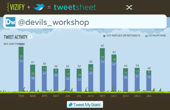
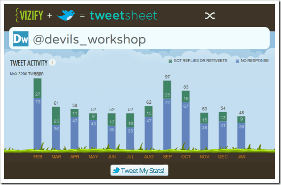
- A quick graph shows the exact number of tweets posted every month. It also includes how many of those tweets got replies or retweets.
- It also shows which were the most retweeted posts from the account through the year, along with the best followers. Best followers are ranked according to the number of times they have retweeted or replied to your tweets.
- Finally, there is a tag cloud which shows which words are most used in your tweets over time.
You can see Vizify Tweetsheet for Devils’ Workshop here. Ideally try sharing this info with your Twitter users, to get people interacting more or simply take a screenshot of all the details and blog about it.
Do try out Vizify Tweetsheet and drop in your comments.
Link: Vizify Tweetsheet

