Google+ from day one had a better layout, better way to manage sharing and better privacy controls than Facebook. Facebook probably knew they had a real competitor out there. Facebook is probably a little nervous and its evidence are the sheer number of changes it has rolled out over the past 2 months.
It started with the tie-up with Skype for video chatting, then allowing much-needed tag approval feature, allowing bigger and faster photos, changing sharing options, introducing new smart lists where friends are added automatically and finally becoming more like Google+ and Twitter by allowing anyone to view publicly shared posts with ‘Facebook Subscriptions’.
Yesterday, Facebook made so many changes to its layout, that it was a little hard to really keep up with them. 🙂
The New Facebook!
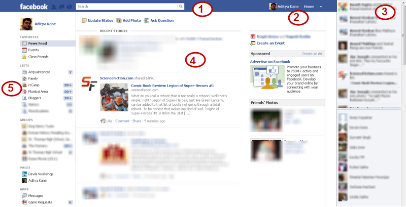
- Sticky Bar at the top: This is borrowed from Google+. The new bar at the top stays even when you scroll down. This makes it a lot easier to navigate and I like this change.
- Change in Profile Options: The privacy options and other account settings options are neatly hidden under a drop down next to the Home tab. This might make it a bit difficult for some non-regular Facebook users to quickly find privacy options.
- The Update Ticker: The real-time updates by friends on Facebook can be a big distraction. I do not like continuous updates filling up. It reminds me too much of my Twitter timeline. 😉
- Home Update: The main updates from feeds are shown with a blue triangle at the top. You can mark it as ‘Top Story”, so it becomes more prominent when you visit your Facebook account next.
- Lists and Updates: This is the best new change about Facebook. The Lists, groups, events, pages are all shown differently in a categorised way. This makes it very easy to share things with people you really want to.

4 Comments
i dont like the new news feed, it looks like facebook is making changes out of desperation. Facebook listen to its users please!
If we could arrange news from friends and pages into lists it would be much better. A news feed list for most important people or pages and a news feed from family members and so on. Right now its all jumbled up
I think the day it tightens up some security people will be happy. changing colors, pictures isn’t something that can make its users happy 🙂 It still shows the image when some comments appear and still people can see the status update no matter how much you hide :/
i changed my fb language to leet speak,
got old layout back 😀
greasemonkey scripts don’t work on new layout :'(